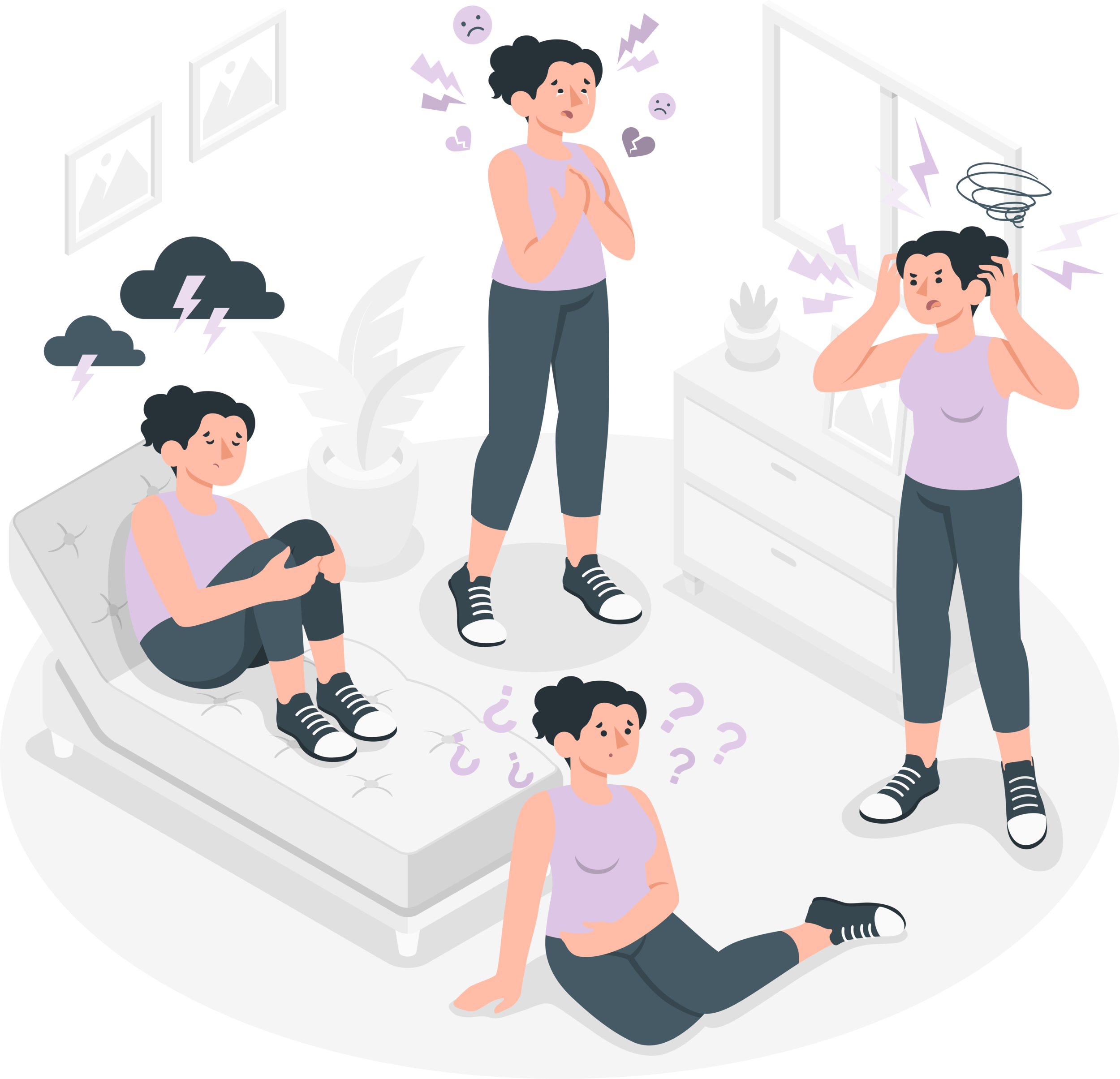
Creating awareness for PPD and providing real time resources to new moms.
Introduction
For this design project, I worked with B-Tech, an East Coast based product solution and deliverables company.
The company presented us with research for an app for mothers experiencing or wanting to prevent post-partum depression.
The Problem
B-Tech needed a strategic way to provide the mothers with everything they would need to complete a 12-week therapy program, while also having access to in person or remote sessions, assignments and resources.
The Solution
My team set out to produce multiple iterations of an interactive high-fidelity prototype designed to help mother’s focus solely on the well-being of themselves and their mother-baby relationship within a united design system and seamless structure.
My Role
I led the weekly progress presentations with stakeholders, created UI for multiple key screens, revamped the UX for multiple flows, coordinated and collaborated extensively with the design team, managed research and the project timeline.
Project Scope
For this project our design team was tasked to produce a high-fidelity interactive prototype that included the following:
Style Guide
At least 2 color theme options
Logo iterations
Creation of Onboarding contents and flow
Creation of Profile contents and flow
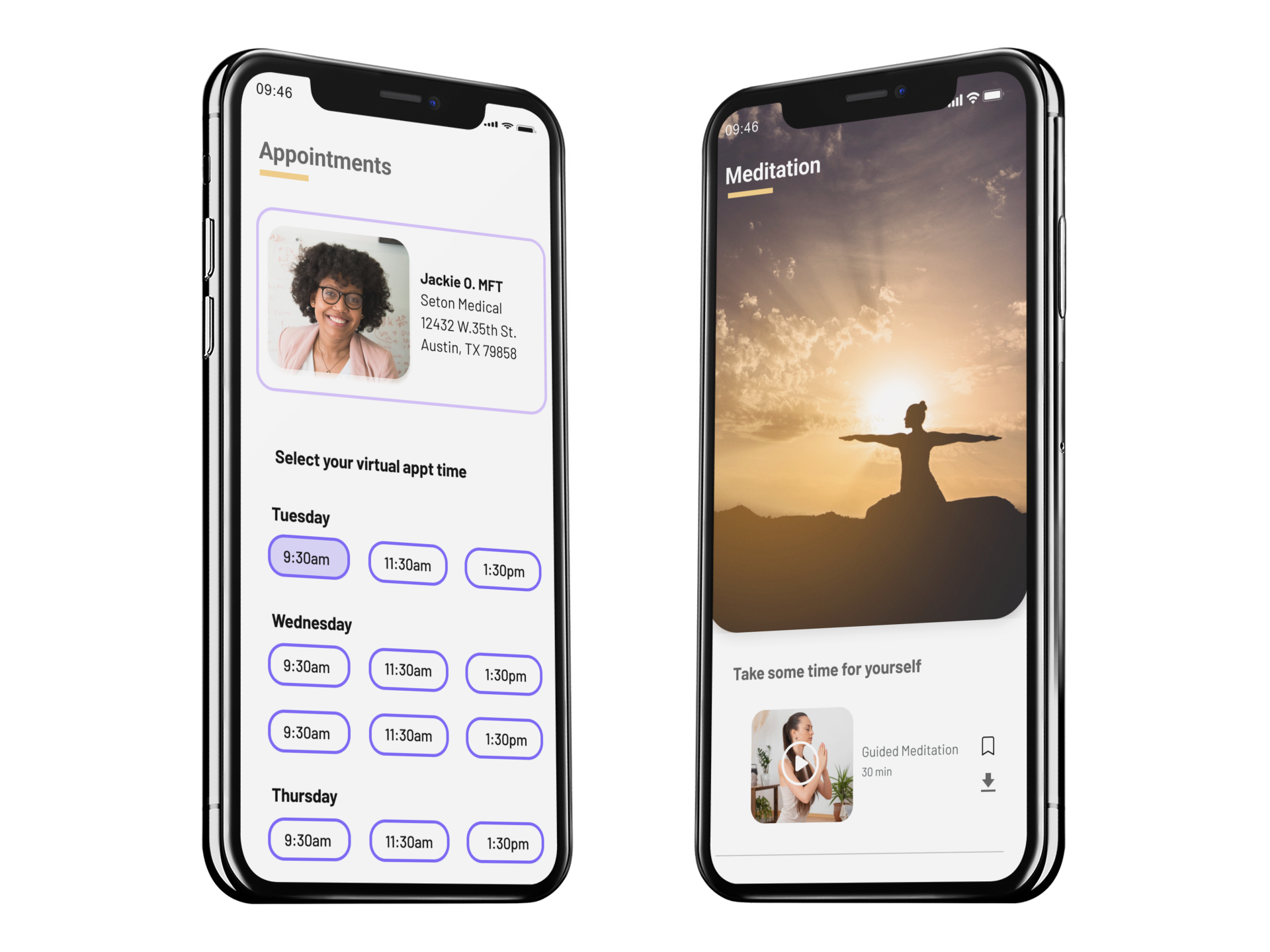
3 Lessons flows from the 12 Lesson program
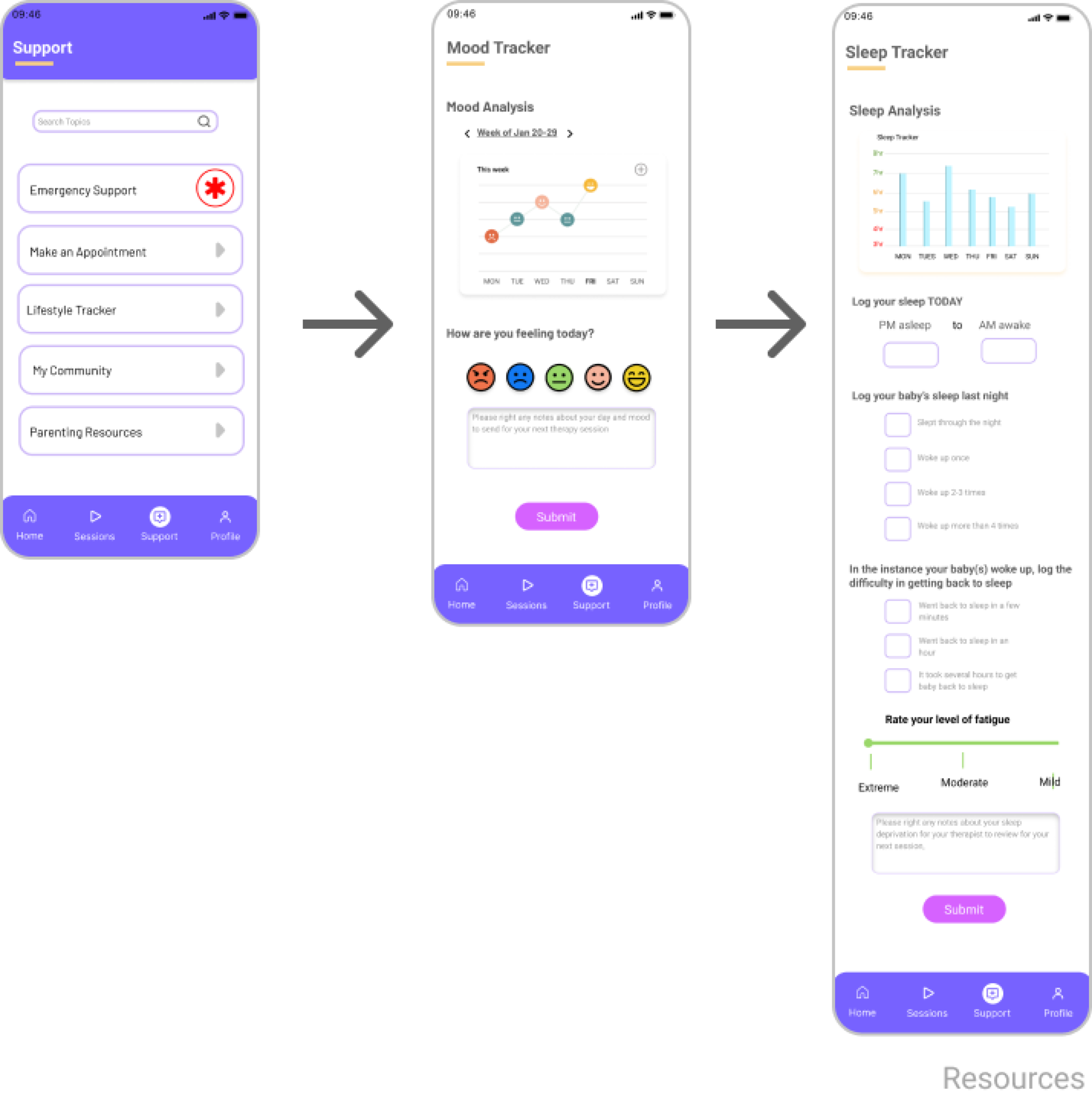
Support Resources, such as a “Emergency Outreach”
Virtual and in-person meeting capabilities with a share screen option on the clinician’s side and a picture in picture option to review class material in sync
Production of final product within a 5-week time frame
Project Timeline
We set up meetings and expectations with the stakeholders twice a week and created shared files as well as a Google Hangout channel to collaborate between meetings.
The project timeline was referenced regularly to ensure the team was on target to meet their goals. Generally, we were ahead of the game in producing deliverable by their weekly deadline.
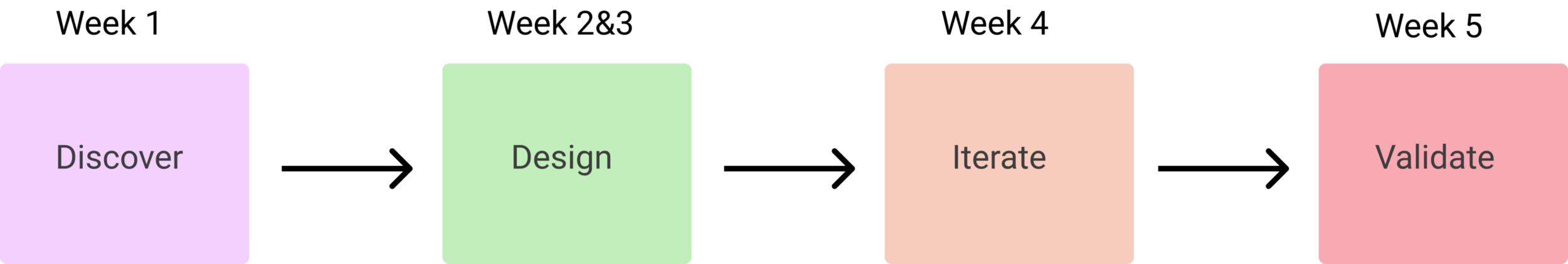
After our initial meeting, a project plan was created, and the team did a deep dive into the research.
Research
Prior to my entrance into this project, the B-tech team conducted an extensive amount of research by way of clinical studies and user focus groups. The research was synthesized and presented to my design team as Personas, Site Maps, and User Flows, which we accessed conveniently through Miro.
The B-tech team also presented us with Low Fidelity wireframes and Hi Fidelity Mockups to consider moving forward.
First Iteration
Based on the information given, our team put together a new color palette and mockup screens for the B-tech team to dissect.
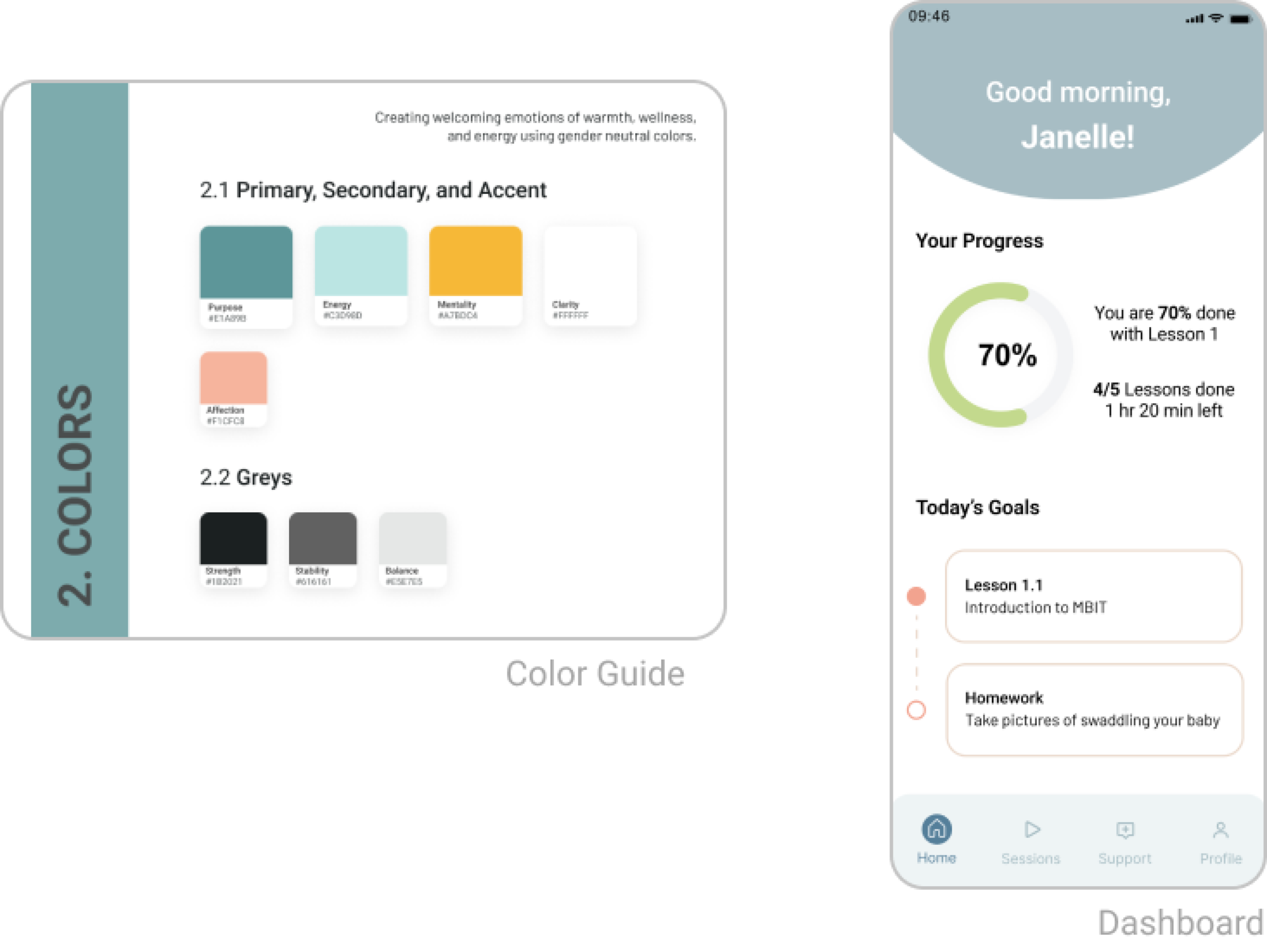
The mock-ups gave them an opportunity to review and select their favorite screen components and iterations so that the team could continue in that style, and with the necessary adjustments.
Second Iteration
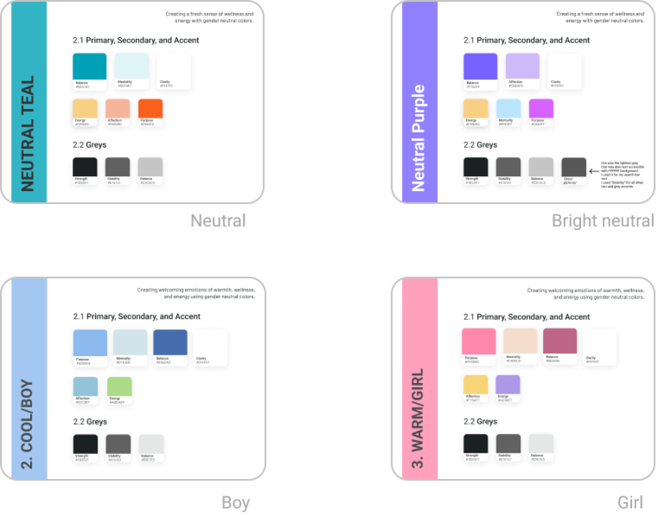
For the second integration a neutral, bright neutral, boy and girl color themes were created. The team decided to work in bright neutral, noting of course that the brightness was preferred.
After reviewing the palettes with the client, we created more extensive flows for onboarding a registered user, a non registered user, insurance input, making an appointment and support resources.
Interactive Prototyping
After a meeting regarding the second iteration, further wants and needs were expressed by the stakeholders for the function and feel of the app. These items were incorporated and changed as we began to make the app interactive.
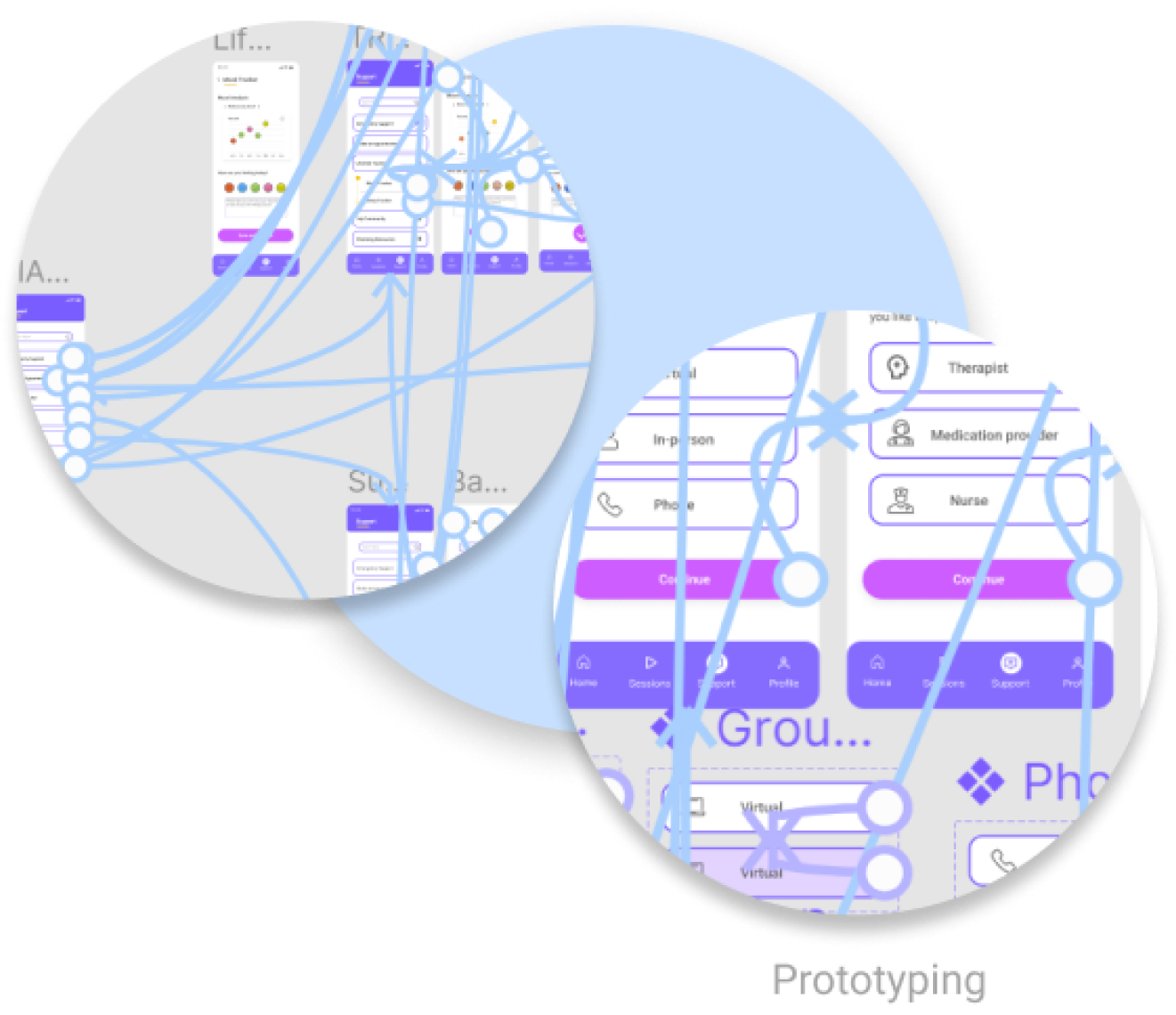
Due to an unforeseen time crunch, the design team enacted an interactive prototyping sprint. We worked in real time via Google Hangout channel and made necessary adjustments along the way. In the end an interactive prototype was delivered for their early morning user test the following day.
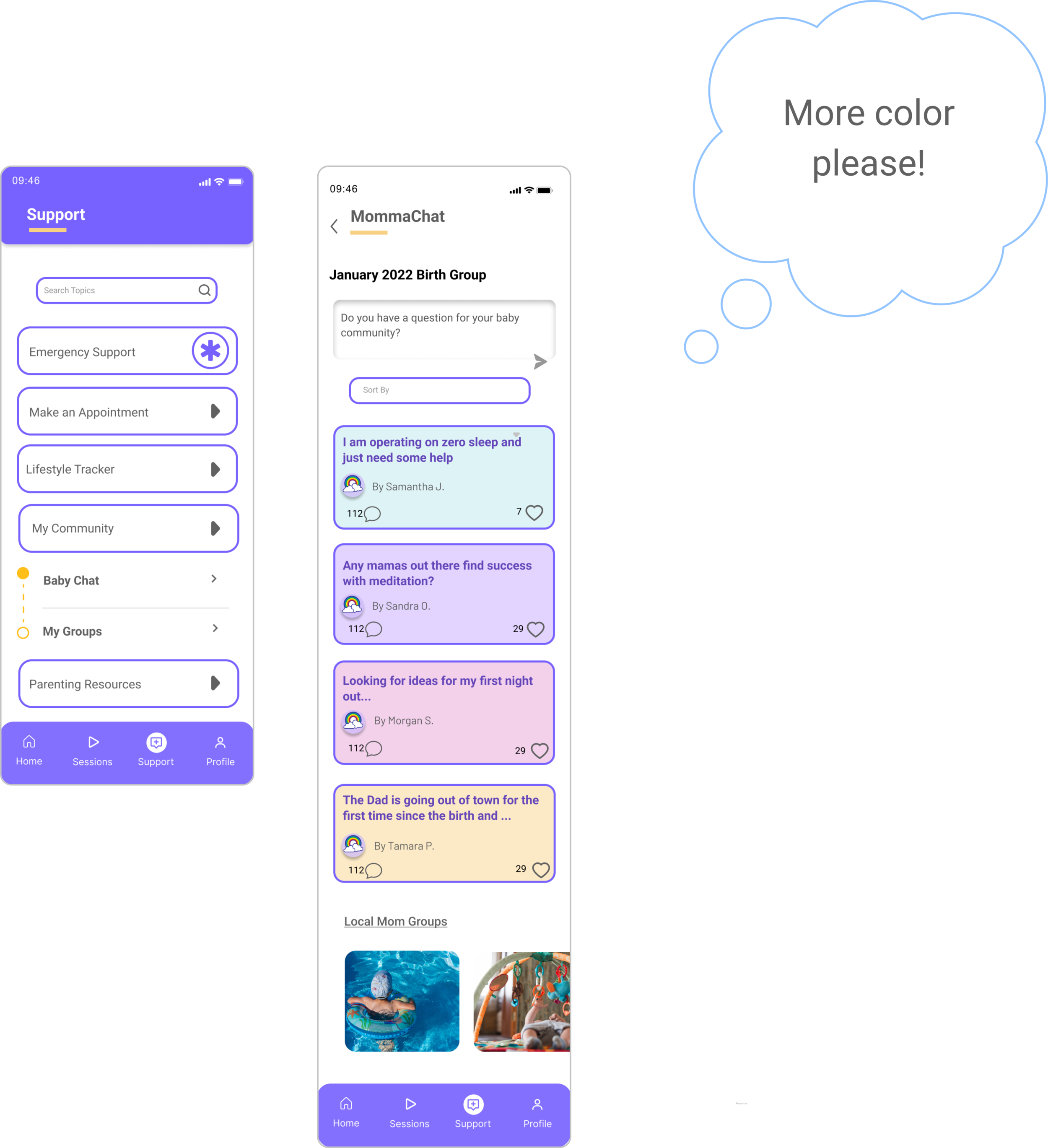
User Focus Group
A User Focus Group was conducted which provided me and my team with a valuable list of insights to consider moving forward. I analyzed and compiled the notes into a comprehensive list and ranked them in order of severity and impact on the user experience.
The design team discussed and addressed each user issue within the app design. New updates were also incorporated based on Stakeholder feedback and new preferences that had come up in the interim.
After all testing, a SUS score was calculated at 75. An admirable number, but the design team was ready to make improvements to increase system usability.
Iterating
*Due to NDA, no full prototype will be available for this project
We made sure to me revisit the stakeholder needs:
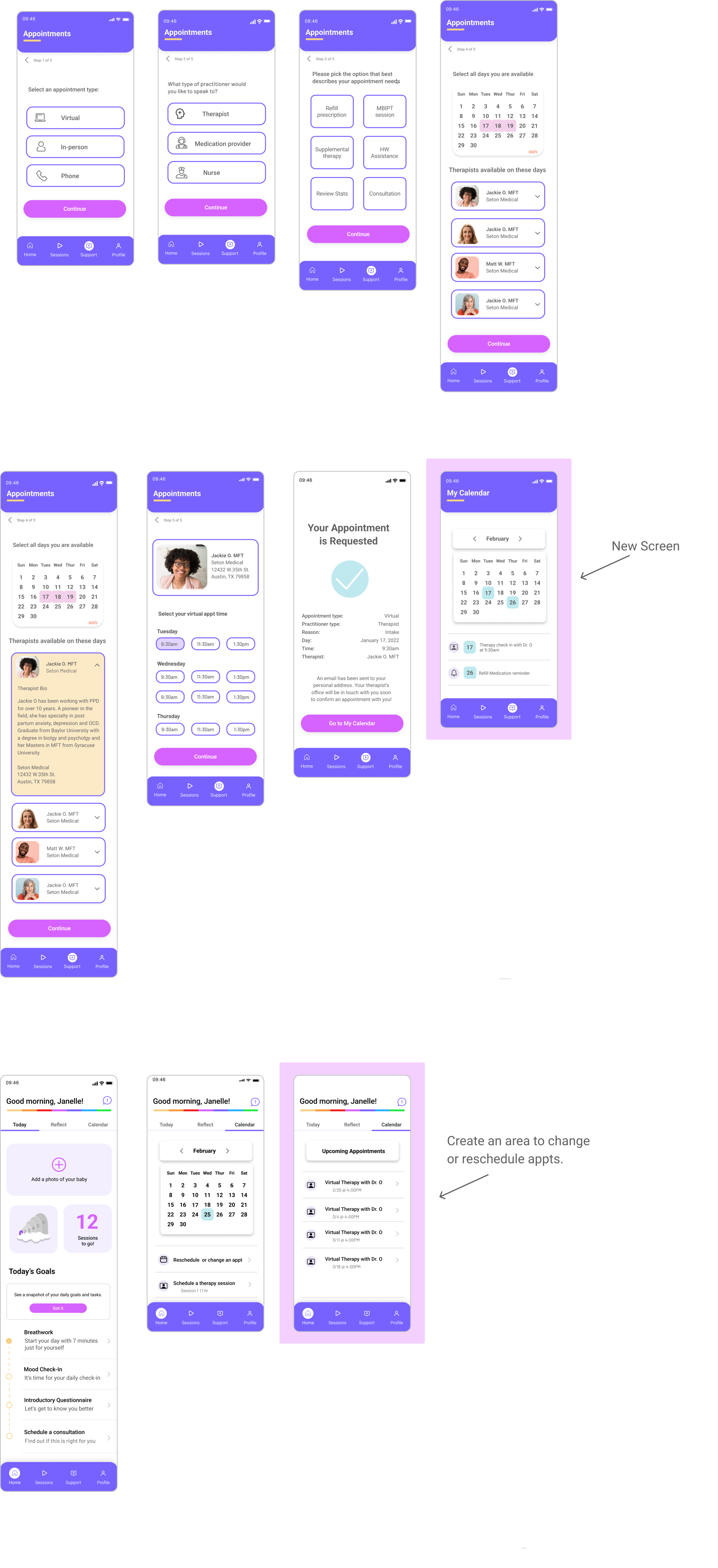
New screens were added to make transitions from task to task feel seamless
*Due to NDA, no full prototype will be available for this project
Next Steps
The updated designs and tightened up iterations will be presented to a new user focus group.
A new SUS score will be calculated, and user insights will be categorized again based on their severity and impact on system usability.
Once all usability issues are addressed, the high-fidelity prototype will be transitioned over to the development stages.
Reflections
After operating solo for almost a year, it was wonderful to collaborate with other designers. We were able to brainstorm, provide insights, feedback and recommendations to one another throughout this project. Given the workload, it also made the process much more efficient to have a team divide and conquer tasks and responsibilities.
For future projects, I would look into dividing roles more clearly so as to unify design and style. For instance, have one person on developing screens, one person prototyping and one person creating the style guide.